Refreshing the PHP.net navbar and search
- 6 minsThe need for a refresh
If you haven’t visited PHP.net in a while, you might have missed some recent facelifts. The most notable update was the new release page for PHP 8, launched in November 2020. This refresh not only modernized the brand look but also did an excellent job at showcasing what’s new in PHP. Following that, other two pages also got some attention: the new home hero section and the thanks page.
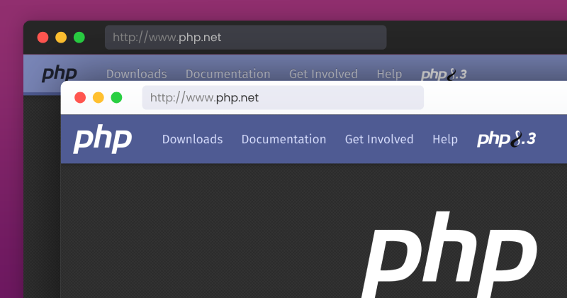
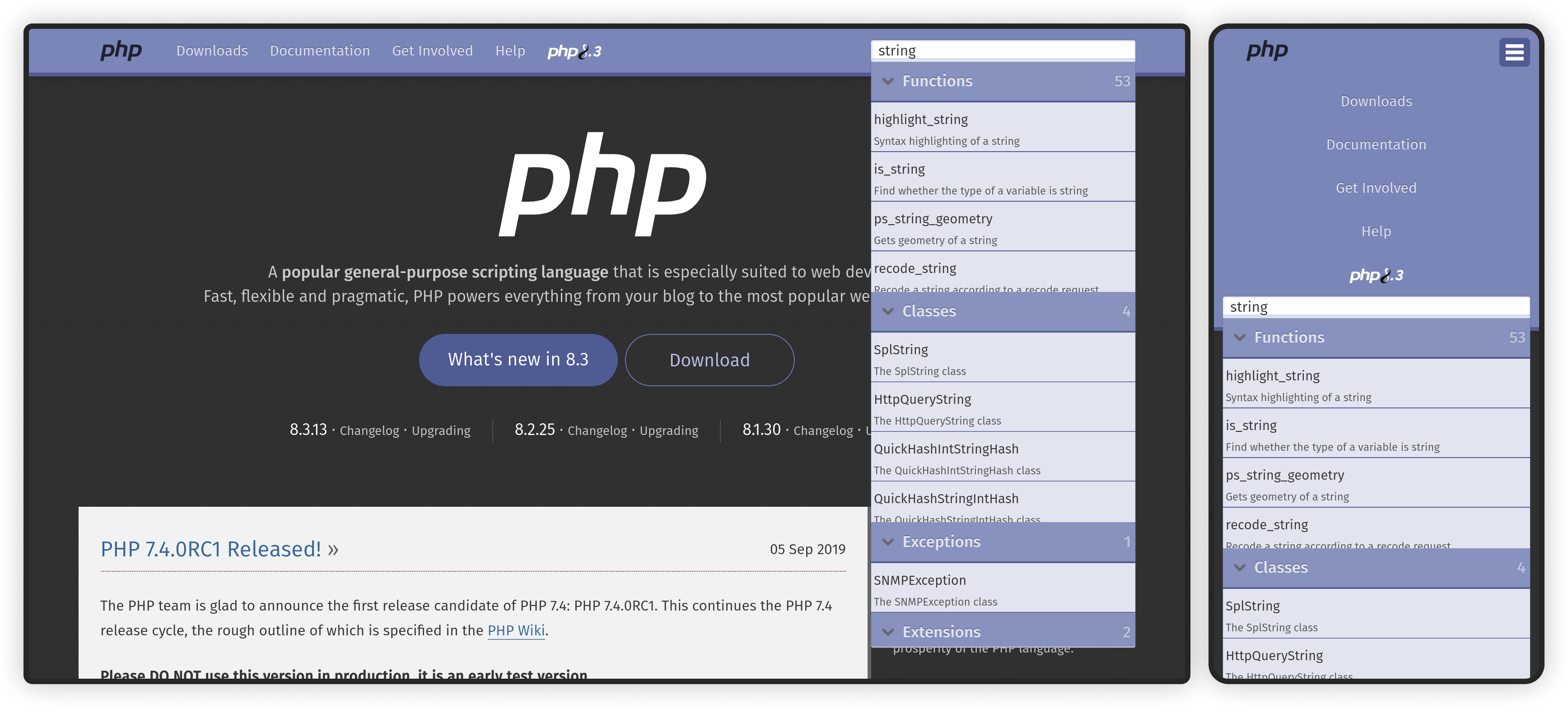
With those improvements, some other areas that had not yet been refreshed started to feel a bit off, and one of them was the navigation bar and its search UI:

The previous navbar had three main issues:
- Contrast: The light blue background made the white text hard to read, possibly explaining the choice of the back PHP logo.
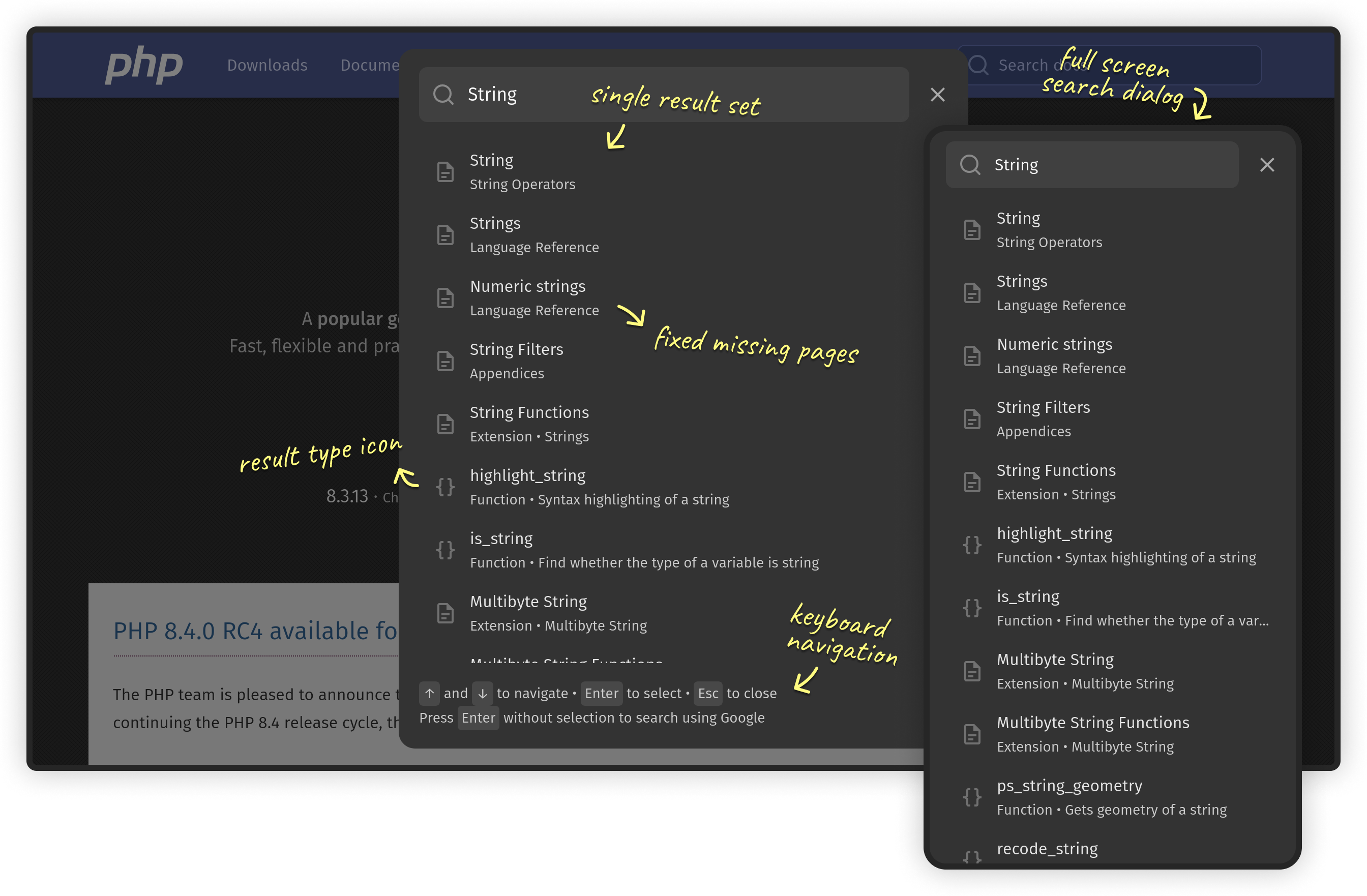
- Search UX: Search results were displayed in a scrollable dropdown divided into 5 categories, each one with its own scroll, creating a nested scrolling experience that made it challenging for users to navigate and find the desired result, particularly on mobile.
- Missing pages: A significant number of manual page, especially from the Language Reference section, were not being correctly indexed. For example, searching for “types” would not list the Language Reference > Types page. This is critical for new users that are still learning the language basics or are not familiar with the documentation structure.
An incremental approach
Back in 2022, discussions began within the community about what a potential PHP.net redesign. A new design was proposed, sparkling interesting ideas and feedback from members. However, due to the large scope of the proposal and conflicting schedules of the team members, the discussion didn’t progress much further.
During the process of decision-making in groups, reaching consensus gets harder and harder as the scope and number of people involved increases. An alternative approach for these cases is to focus on smaller incremental changes, and follow a consent over consensus method for decision-making12.
Following this principle, I figured it would be a better idea to start with a smaller component. I choose one from my iteration in the full redesign proposal that seemed to be well received by the community: the navigation bar.

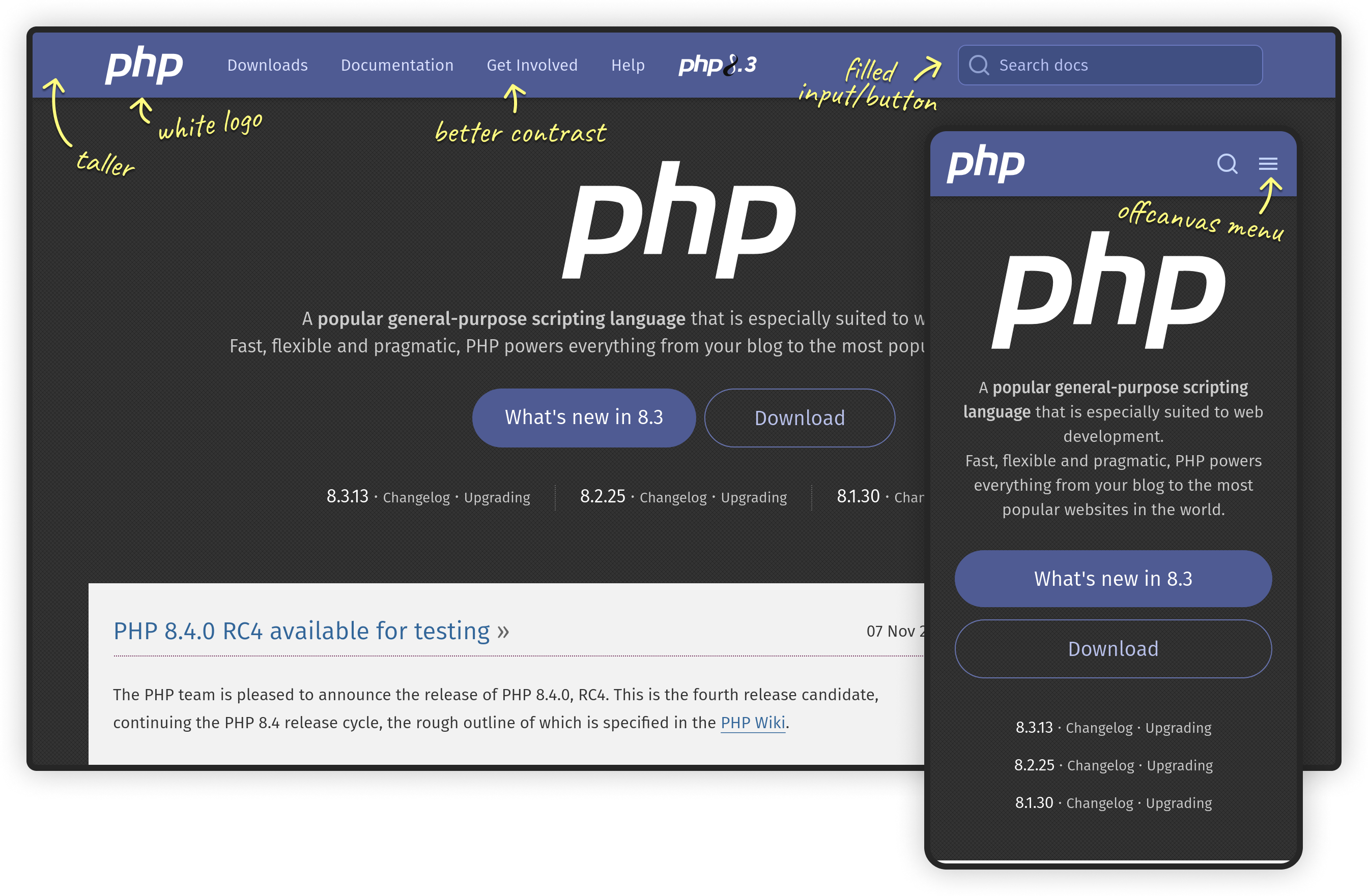
It became clear early on that redesigning the navbar without addressing the search would create a mixed experience that would be perceived as worse than the previous version. For this, I took inspiration from Algolia’s DocSearch UI, widely used in documentation sites nowadays. Here’s the result:

Paying off technical debt
The PHP.net front-end codebase has accumulated some technical debt over the years. The stylesheets are based on Bootstrap 2 and it’s float based responsive grid system (remember the .clearfix era?), and make heavy use of nested rules that complicates maintenance and reusability. On the JavaScript side, the previous search UI was a custom JQuery plugin that used Twitter’s typeahead.js for autocomplete and Hogan.js for templating — both of which are no longer maintained.
This presented an ideal opportunity to remove these dependencies from the navbar, making it more maintainable and future-proof. The markup was rewritten from scratch using the Bootstrap 5 offcanvas navigation component as a base reference. The styles now use current CSS features such as flexbox and variables, and follows the Block Element Modifier (BEM) methodology adopted in previous contributions to avoid specificity issues and naming conflicts.
The existing search was implemented client-side using a JSON index of the manual pages. While this may not be the best approach for a large site like PHP.net, replacing it with a server-side implementation was beyond this proposal’s scope. Instead, I focused on removing the JQuery dependency and fixing the most critical issues34 it had, which resulted in significant short-term improvements with relatively minimal effort. The new UI was implemented using vanilla JavaScript with accessibility and progressive enhancement in mind, as we’ll see in the next sections.
Progressive enhancement
This was an interesting requirement that I hadn’t anticipated: both the mobile navigation and the search should work even if JS is disabled or fails to load. Admittedly, this wasn’t something I considered before, and while one may think that this is a rare scenario, it’s actually not. JavaScript, unlike HTML, is not fault-tolerant, and errors or network issues can critical features that rely exclusively on it.
Surprisingly, many major programming language sites require JavaScript for essential functions like mobile navigation and search. As of this writing, sites such as Kotlin, Rust, Swift, MDN and Dart all require JS for one or both of these functions. This dependency is also common in most Algolia’s DocSearch powered documentation and sites using the MkDocs default theme.
A simple solution to this problem is to use progressive enhancement. This strategy recommends fault tolerant web technologies like HTML and CSS to provide a baseline implementation, and only then use JavaScript to enhance the experience. This approach ensures accessibility across devices and network conditions, while still offering a more interactive and dynamic experience when possible. The GOV.UK website is an excellent example of this practice and served as reference for our implementation.
Accessibility
Accessibility was another area I’ve been wanting to get more involved with, and this contribution was really a great opportunity to do so. Implementing the ARIA roles and attributes correctly, ensuring focus indication and management, and making the new features keyboard accessible were definitely fun tasks. Recently, I had the chance to experiment Playwright for testing, and it was reassuring to find that the codebase already had some visual regression tests in place. So new end-to-end tests were added using Playwright’s emphasis on semantic HTML to ensure the new UI remains accessible.
Conclusion
Redesigning and implementing the PHP.net navbar and search UI was both an interesting and rewarding experience. With the valuable review and feedback from the active maintainers I was able to polish the design, improve the user experience, address technical debt and enhance accessibility, while still keeping it familiar to visitors.
I’m happy to share that the PR I proposed and implemented was accepted, and the new navbar is now live on PHP.net. But there are still a lot to be improved, particularly in the documentation section. So, if you are looking for a way to contribute to open source and/or improve your design and development skills, this is a great opportunity. Keep your scope focused, discuss your ideas with the community before starting, and be open to feedback but focus your efforts on integrating the objections.
